I broke out the old watercolors again this weekend. I need to finish up a couple of note cards for some friends, and my drawing of Mom (from Futurama fame) has been taunting me. She’s all stretched out and stapled to my painting board, just waiting to be juiced up in living color. Or at least in plastic color.
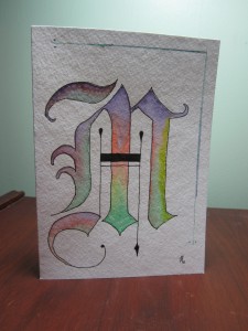
 I’ll start with the letters. Here is the M. I like the structure of the letter, but I wish I would have used a smaller palette of colors. This is quite the rainbow M!
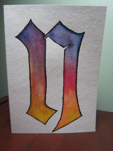
 The N started out really well. I was really happy with the balance of the letter, and the straightness of the lines.
 I mucked up the painting of the letter, though. The left-hand side got too muddied, and no amount of lifting the paint off would get it ethereal anymore.
As Tim pointed out to me yesterday, however (which amazingly came as sort of an epiphany to me), I have a tendency to focus on the negative. I should focus on the right side of the letter, with which I am quite happy. Half good is better than no good.
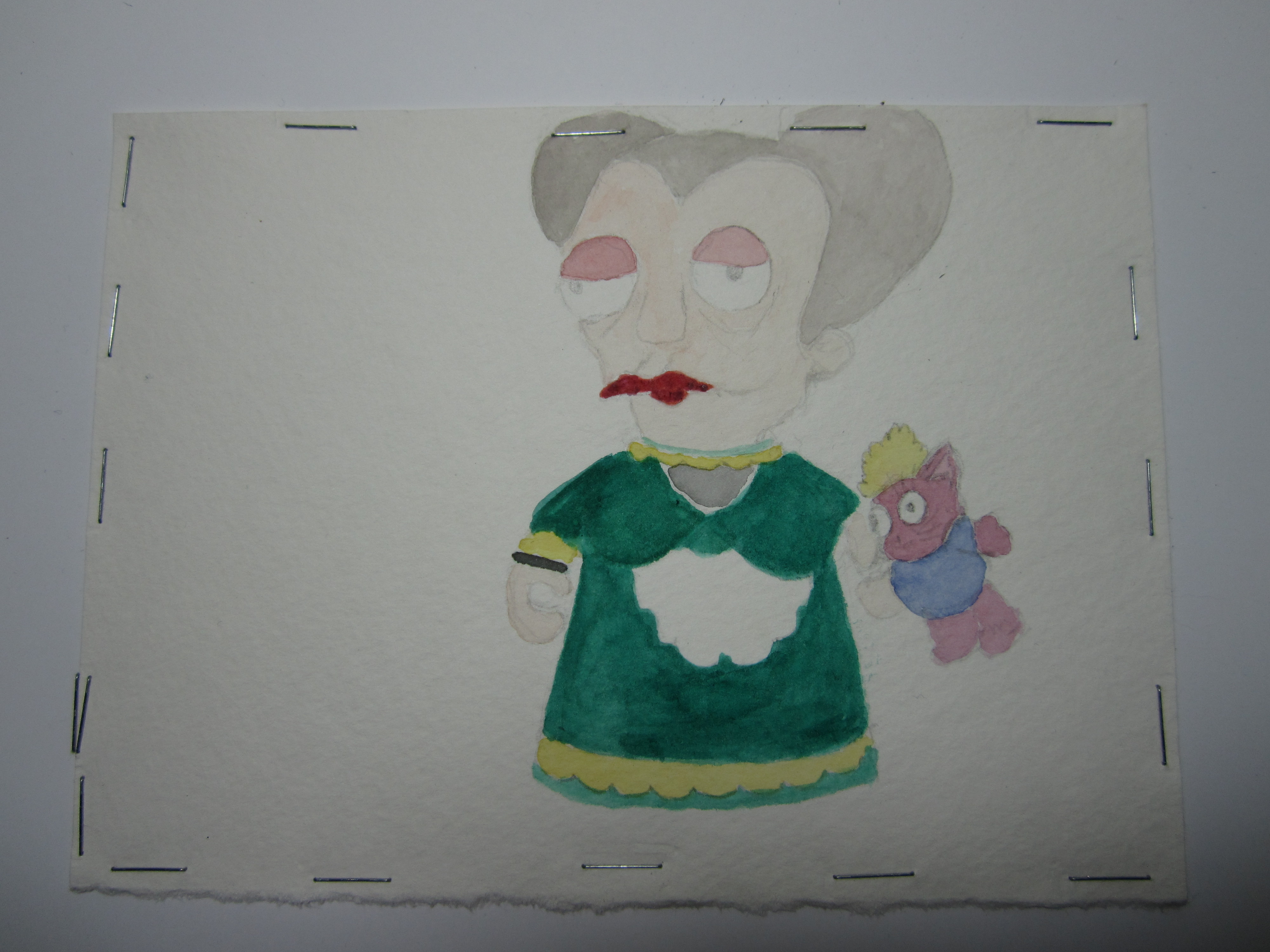
 And…on to Mom. I only have the base colors done so far. She needs some more layers to get the colors right, and then some shading to finish her up. I think she’ll look really cool when she’s done, though.
Look closely, and you will see that Mom’s hair is too big for the paper, and she has 2 staples through it. I am spatially challenged, what can I say. Maybe that can be my thing – my claim to artistic fame – all of my art runs off the page due to bad centering. Ah, I’m waxing negative again, damn it!
Hopefully next week I can finish up the Mom painting and the cards, so I can figure out what to do next. Mom (my mom, not the Futurama mom) and I are taking a watercolor paint class in Chicago (taught by Mark Polomchak) in February, so I need to practice some more, so I can keep up with the rest of the class.
Take care, and best wishes on your creative projects!

What a cool idea with the lettering, and I kind a like the multicolor on a classic font.
Heather, Your M is absolutely gorgeous!!!!!!!
What a wonderful work of art!
Have you ever taken a good look at art?
Many of the pictures go right off the page.
Centering an object is soooooo boring!
Keep on truckin” hon,
you’re right on the money!
Thanks for the positive feedback!
i just now noticed this:
I’ll start with the letters. Here is the M. I like the structure of the letter, but I wish I would have used a smaller palette of colors. This is quite the rainbow M!
lets take a closer look, shall we???
This is quite the rainbow M
Upon further inspection, it appears someone is trying to make an innuendo at this moi!
Ha! I am inadvertently slamming you all over the place lately!