As I mentioned in my last post (several weeks ago; I’m sorry to say), I worked on an art project a few weeks ago. At the time, I couldn’t post pictures because the art was going to be gifts to my family. But, Mom and Dad’s anniversary is over, and all the art was given to its intended recipients, so I can post pictures now.
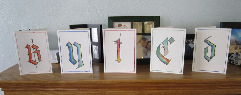
As I’ve mentioned before, I dislike doing backgrounds when I draw or paint. I also enjoy doing calligraphy even though I am no good at it, due to a tremendous lack of practice. Well, a couple of months ago I ran across Strathmore notecards made of watercolor paper. I was intrigued and tempted by their small size. I decided to marry my love of calligraphy with my dislike for large pieces of paper and made these:
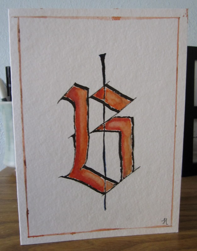
 With very light pencil lines, I drew centering lines vertically and horizontally. I then used the Speedball Textbook to find a type of font that I liked. I settled on blackletter, a beautiful gothic font. Since, as I previously mentioned, I never practice calligraphy as I should, I cannot reliably free-form the letters. Instead I sketched them out, trying to get the angles and shapes correct. It was difficult to see if the shape was perfect until the lines were filled in, however. As a result, some of the angles are off. There is something a little wrong with the bottom of this B, but I can’t quite figure it out…
 Once I was fairly satisfied with the penciled-in letters, I went over my pencil lines with a Pilot Parallel pen (quick aside here – I love this pen. I hadn’t used it in months and months, but I just ran some warm water over the nib, and the ink starting flowing freely immediately. It’s super easy to use). As you can see in some of the more up-close photos, the ink did not lay on the paper completely evenly. This is mostly due to the grain of the watercolor paper – it’s not the best medium for a calligraphy pen. I think I should have used an Artist Pen, like the Faber-Castell Pitt Artist Pen, something that is waterproof and super black. I also had issues with the ink from the parallel pen bleeding into the watercolor. I kind of like how it looks, though – a little scratchy, a little messy. I didn’t want the letters to look as if they were created on a computer.
Once the letters were drawn on with the pen, I started filling them in with watercolor. My mom lent me several tubes of beautiful watercolor paint, but I resorted to using my cheap little Prang set. My workspace is very truncated, and the Prang set is so nice and compact. I mixed colors together that I thought were pretty and interesting, just to see how they would look. In short, I experimented.
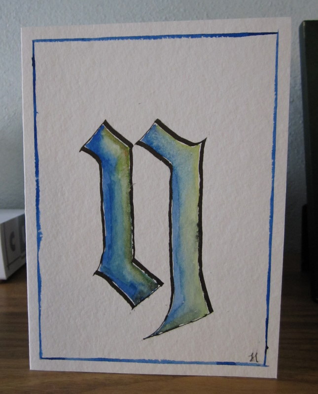
Blue fading to green for Nathan:
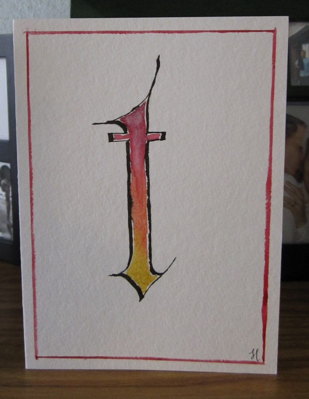
 Red fading to yellow for Timmy Tee:
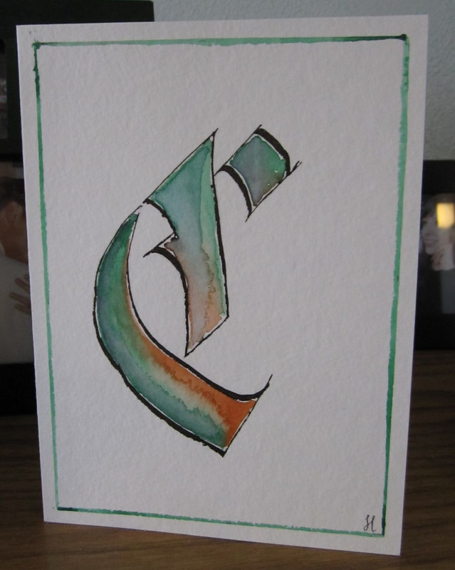
 Inspired by the Celticness of the C for Charles, my Dad, I did green fading into orange.
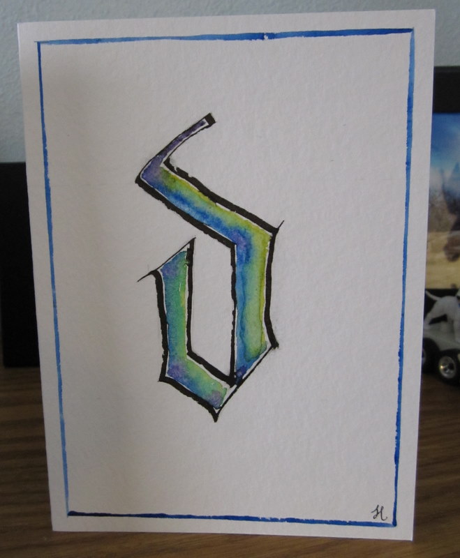
 To match my Mom’s gorgeous blue eyes, I did blue fading to yellow for Donita. This is actually Take 2 for Mom’s card. The first D I did for her was done using Uncial, a more rounded script. I had a hard time getting the balance of the letter correct, and the color was not quite right. When I tried to fix it, it just turned to mud. So, I started over, and the second one turned out much better.
 It’s hard to tell in the photos, but on each letter, I threw salt on the paint when it was still wet. The salt absorbs some of the paint and gives it a slightly mottled look. I just had to be careful to wait until the paint was completely dry before scratching off the salt; otherwise, smear city.
Once the letters were done, the cards looked a little too empty, so using a ruler I painted a border on each card, using the major color of the letter.
I wasn’t sure what to actually write inside the cards once they were finished. “Happy Anniversary, Love Heather” just seemed too generic. Tim gave me the idea to write a haiku in each card. I haven’t written anything remotely poetic in probably a decade, but it sounded like fun. I wrote 3 haikus for each person, and Tim picked out the one to put in the card. They were nothing very earth-shattering or very clever, but I enjoyed writing them, and at least they will never receive a card from someone else with the exact same verbiage on it.
I want to make some more cards, so yesterday Tim and I took the 15 minute trip to Evergreen Art Works to get some more cards. Unfortunately, they were plumb out. They had every other single kind of card; just not watercolor cards. Argh. However, I kept looking around, hoping to find some cards forgotten on an end-cap somewhere, and found something else super cool – Artist Trading Cards. They are these tiny (2.5″ x 3.5″) pieces of paper on which people create a piece of art. The art is then supposed to be traded with other artists at some sort of art swap meet. It’s amazing how creative people can be on such a little piece of paper. Check out these images.
I can’t find any swaps in our area, so maybe we’ll have to start one. I’m trying to talk Tim into doing some. He is a super creative artist, and could make some really trippy ATCs.
Well, if I keep writing, I’ll never get to the cards, so I best sign off. Happy arting everyone!
 I must say, though, that painting on 2.5″ by 3.5″ pieces of paper is tough. I need to drink like 50 cups of chamomile tea to steady my hands first.
